

模态框是完全用 JavaScript 构建的弹出窗口。 构建模态组件变得容易 使用 Vue 插槽 。 单击下面的按钮以查看基本模式。
构建模态组件
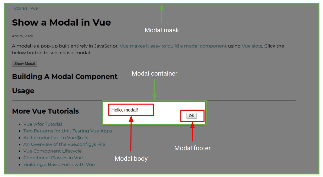
模态组件可以分解为 4 个重要元素:掩码、容器、页眉和页脚。 以下是这些元素在屏幕上的显示方式。
![图片[1]-在 Vue 中显示模态弹窗-技术鸭(jishuya.cn)](http://oss.jishuya.cn/wp-content/uploads/2022/09/20220911085853-631da34d247c7.jpg)
蒙版是部分隐藏页面的灰色背景,容器是包含页眉和页脚的白色框。下面是上述模式的 CSS,从 这个页面 。
.modal-mask {
  position: fixed;
  z-index: 9998;
  top: 0;
  left: 0;
  width: 100%;
  height: 100%;
  background-color: rgba(0, 0, 0, 0.5);
  display: table;
  transition: opacity 0.3s ease;
}

.modal-wrapper {
  display: table-cell;
  vertical-align: middle;
}

.modal-container {
  width: 300px;
  margin: 0px auto;
  padding: 20px 30px;
  padding-bottom: 40px;
  background-color: #fff;
  border-radius: 2px;
  box-shadow: 0 2px 8px rgba(0, 0, 0, 0.33);
  transition: all 0.3s ease;
}

.modal-default-button {
  float: right;
}

/*
 * The following styles are auto-applied to elements with
 * transition=modal when their visibility is toggled
 * by Vue.js.
 *
 * You can easily play with the modal transition by editing
 * these styles.
 */

.modal-enter {
  opacity: 0;
}

.modal-leave-active {
  opacity: 0;
}

.modal-enter .modal-container,
.modal-leave-active .modal-container {
  -webkit-transform: scale(1.1);
  transform: scale(1.1);
}
modal 组件是一个标准的 Vue 组件,有 2 个命名槽: header 和 footer,下面是 modal 组件定义。
Vue.component(modal, {
  template: `
  <transition name=modal>
    <div class=modal-mask>
      <div class=modal-wrapper>
        <div class=modal-container>
          <div class=modal-body>
            <slot name=body>
            </slot>
          </div>

          <div class=modal-footer>
            <slot name=footer>
              <button class=modal-default-button @click=$emit(close)>
                OK
              </button>
            </slot>
          </div>
        </div>
      </div>
    </div>
  </transition>
  `
});
modal 组件本身并没有做太多事情。 它只公开了 2 个命名插槽。 footer slot 有一个默认值,只要用户单击 确定 按钮,就会发出一个 关闭 事件。
用法
你如何实际使用这个模态组件? 您需要 使用 v-if,因为如果模态组件被渲染,遮罩将隐藏页面。 以下是支持此页面模式的 Vue 应用程序:
const app = new Vue({
  data: () => ({ showModal: false }),
  template: `
    <div>
      <button @click=showModal = true>Show Modal</button>
      <modal v-if=showModal @close=showModal = false>
        <template v-slot:body>
          Hello, modal!
        </template>
      </modal>
    </div>
  `
});
app.$mount(#vue-modal-example);
v-if 指令告诉 Vue 仅在以下情况下挂载模式 setModal 是真的。单击按钮设置 showModal = true,它告诉 Vue 挂载模态框。 <template v-slot:body> 告诉 Vue 在 body 投币口。 既然没有 footerslot,Vue 使用默认的 footer HTML。
最后,一旦模态框发出 关闭 事件,该模板负责隐藏模态框。 modal 组件 不允许 关闭自己,调用代码负责隐藏它。
© 版权声明
文章版权归作者所有,未经允许请勿转载。
THE END


请登录后查看评论内容